


Designing eye-catching for sale signs is one of the most effective ways to capture the attention of potential buyers and generate real estate enquiries. By prioritizing high-contrast colors, bold typography, and strategic placement, you ensure your message stands out. Every detail matters. Whether you are a real estate agent or a private seller, mastering visual impact can significantly shorten the time it takes to sell.
Focus on these essential elements for the best eye-catching designs:
- High-contrast color palettes improve visibility from a distance.
- Minimalist layouts prevent information overload for passing traffic.
- Durable materials maintain a professional appearance in all weather conditions.
- Clear calls to action guide interested buyers to the next step.
Ultimately, creating strong first impressions comes down to quality and trust. By using consistently strong layouts, you signal professionalism to every passerby.

Essential Principles for Designing Eye-Catching Signage
In the modern urban landscape, where consumers are bombarded with visual stimuli, the art of Designing Eye-Catching signage is a fundamental requirement for business survival. Whether you are a boutique owner or a marketing executive, understanding the mechanics behind visual communication is essential. Signage serves as the silent ambassador of your brand, working 24/7 to convey your message and identity to passersby who may only give your storefront a fleeting glance of less than two seconds.
To master the craft of Designing Eye-Catching displays
One must appreciate the balance between aesthetics and functionality. A sign that is beautiful but illegible fails its primary purpose, while a sign that is informative but dull will likely be ignored. The principles in this section provide a blueprint for creating visual markers that grab attention and retain it long enough to trigger action. From the use of negative space to the application of color theory, every element plays a pivotal role in the final impact of your physical branding.
One critical aspect of designing Eye-Catching signage is “Conspicuousness.” This refers to how well a sign stands out from its environment. If your business is located in a street filled with neon, a minimalist wooden sign might be more conspicuous. Conversely, in a dark industrial area, a bright LED display becomes the focal point. Context is everything. You must analyze the background, lighting conditions, and competing visual noise before sketching your first draft.
Typography is the backbone of any effective sign. When you are Designing Eye-Catching signage for high-traffic urban environments, the choice of font can make or break the project. Sans-serif fonts are preferred for outdoor signage due to their clean lines and high readability. However, the weight of the font, the kerning, and the leading are equally important. If letters are too close, they blur into an unrecognizable shape when viewed from a moving vehicle. Professional designers use the “10-foot rule” to test legibility across various scales.
Color theory is another pillar. High contrast is the golden rule. Black text on a yellow background or white text on a dark blue background offers the highest levels of readability. While it might be tempting to use your brand’s exact pastel palette, those hues often wash out under direct sunlight. Designing a Eye-Catching sign requires a willingness to adapt brand colors for the sake of outdoor performance. You want colors that pop and demand to be seen without causing visual fatigue.
Consider the following checklist of essential design elements to ensure your signage hits the mark:
- Visibility and Scale: Ensure the size of the text is proportionate to the speed of passing traffic.
- Contrast: Use a dark-on-light or light-on-dark approach to make the message jump forward.
- Simplicity: Avoid clutter. a sign should convey one primary message or emotion.
- Material Quality: The physical substrate (metal, wood, acrylic) reflects the quality of your services.
- Lighting: Consider how the sign looks at 2:00 PM versus 2:00 AM.
The layout of your sign should follow a logical hierarchy. The most important information—usually the business name or a primary call to action—should occupy the largest portion of the visual field. Secondary information, such as a website URL, should be smaller but still legible. Many designers make the mistake of trying to fit too much information onto a single board. Remember, Designing Eye-Catching signage is about impact, not about providing an exhaustive directory. If you overwhelm the viewer, they will look away.
Integrating your physical signage with your digital presence is a modern necessity. For instance, a well-designed sign can lead a customer to your website, where they can experience a highly creative UI/UX workflow that converts their interest into a sale. This seamless transition between the physical and digital world defines successful modern marketing. Your sign is the “entry point” of your physical location.
Negative space, often referred to as white space, is the “breathing room” around your design elements. In the world of Designing Eye-Catching graphics, negative space is a powerful tool used to direct the eye. By leaving enough room around your logo, you prevent the design from feeling cramped. This clarity allows the brain to process information faster, which is vital when your audience is moving. A sign that is 30% to 40% empty space is often significantly more effective than one that is packed to the edges.
Furthermore, the psychology of shapes should not be underestimated. Circles tend to evoke feelings of community and softness, whereas squares suggest stability and professionalism. When you are Designing Eye-Catching layouts, the border of the sign acts as a frame for your message. A unique shape can act as a “pattern interrupt,” breaking the monotony of rectangular buildings and standard street signs, thereby drawing more eyes to your brand.
“Design is not just what it looks like and feels like. Design is how it works, especially when it comes to the immediate communication of a brand’s physical presence.”
Durability and material choice are intrinsic to the design’s long-term success. A faded or cracked sign sends a message of neglect. When Designing Eye-Catching assets, you must select materials that can withstand UV rays, rain, and wind. High-quality aluminum or UV-resistant plastics ensure that the vibrant colors and sharp lines remain intact on the street for years. The tactile nature of the sign, its texture and finish, also adds a layer of “perceived value” to your business.
Another factor is the “Viewing Angle.” A sign might look perfect at eye level, but how does it look from a car window forty feet away? Designing Eye-Catching signage requires an understanding of three-dimensional space. Sometimes, adding a dimensional element, such as raised “push-through” letters can create shadows that enhance readability and add a premium feel that flat vinyl cannot replicate.
In conclusion, the goal of Designing Eye-Catching signage is to create a “visual hook.” This hook is what stops a person in their tracks. It is the combination of bold choices and disciplined execution. By adhering to the rules of contrast, typography, and spatial awareness, you create a foundation upon which all other marketing efforts stand. In the following sections, we will delve deeper into the technical specifications and psychological triggers that turn a simple sign into a powerful conversion tool.
Effective signage also acts as a landmark. Think of the most famous signs in the world; they are not just advertisements, they are part of the geography. While your local business might not reach the scale of the Hollywood sign, the principle remains: you want your location to be “the place with the striking blue sign.” This level of recognition is achieved through consistent, high-quality design choices that prioritize the viewer’s experience above all else.
As you move forward, keep these principles at the forefront. Every color choice and every inch of negative space is a decision that impacts your bottom line. Designing Eye-Catching signage is an investment in your brand’s future, ensuring that in a world of noise, your voice is the one that is clearly heard and remembered.
Choosing the Right Colors and Fonts for Maximum Visibility
When you are Designing Eye-Catching marketing materials, the psychological impact of color cannot be overstated. High contrast is the golden rule for visibility. For instance, dark text on a light background remains the standard for readability, but bold neon accents can draw immediate attention to calls-to-action. Understanding color theory ensures that your brand remains memorable while effectively guiding the user’s eye toward the most important information on the page.
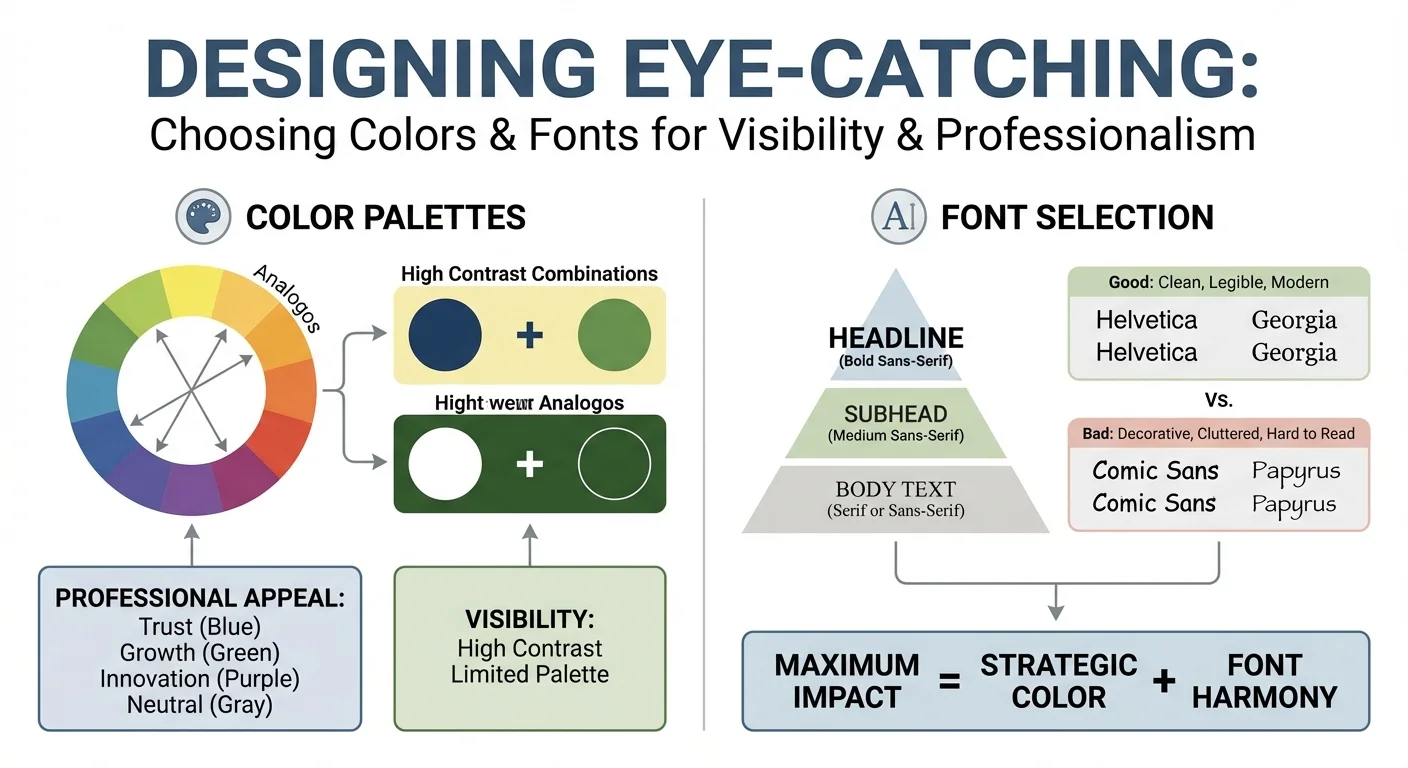
Typography plays an equally vital role in the process of Designing Eye-Catching layouts. A common mistake is using too many different typefaces, which creates visual clutter. Instead, stick to a maximum of two or three fonts that complement each other. Sans-serif fonts are preferred for digital screens due to their clean lines, whereas serif fonts can add a touch of traditional authority to printed designs or long-form editorial content.
To ensure your project succeeds, consider these essential elements for Designing Eye-Catching visuals for digital marketing campaigns:
- Color Hierarchy: Use a primary color for 60% of the design, a secondary for 30%, and an accent color for 10%.
- Font Weight: Utilize bold and light versions of the same font family to create a clear information hierarchy.
- Whitespace: Never underestimate the power of empty space to make your Designing Eye-Catching elements pop.
- Readability: Test your font sizes on multiple devices to ensure the text remains legible at all scales.
Implementing these strategies is a core part of a highly creative UI/UX workflow. By balancing aesthetics with functionality, you create a seamless experience. Designing Eye-Catching assets is not just about beauty; it is about communication. When Designing Eye-Catching banners, always prioritize the message. If the font is too decorative, the audience might miss the value proposition entirely. Consistency in your color palette and typography builds trust and reinforces brand recognition across all platforms.
Placement Strategies to Complement Your Eye-Catching Design
Creating a visual masterpiece is only half the battle. To truly convert users, you must understand where your assets live. Designing Eye-Catching banners or landing pages requires a deep understanding of visual hierarchy and user flow. If your masterpiece is hidden below the fold, its impact diminishes instantly. Strategic placement ensures that your creative efforts are rewarded with high engagement rates and meaningful interactions.

When considering the layout, think about the “F-pattern” or “Z-pattern” that users typically follow when scanning a webpage. Designing Eye-Catching elements should be positioned at these natural focal points. For instance, placing a high-contrast call-to-action button in the upper right corner or centered within a hero section can guide the viewer’s eye exactly where you want it to go. This synergy between aesthetics and positioning is what separates amateur work from professional results.
To maximize the effectiveness of your layout, consider these essential placement tactics:
- Above the Fold: Ensure your primary Designing Eye-Catching assets are visible without scrolling to capture immediate attention.
- Whitespace Utilization: Surround your key visuals with enough negative space to prevent cognitive overload.
- Contextual Relevance: Place your designs near related text content to reinforce the message.
- Mobile Optimization: Test how Designing Eye-Catching graphics scale and shift on smaller screens to maintain their integrity.
Furthermore, integrating your visuals into a comprehensive Designing Eye-Catching framework for digital platforms will help maintain brand consistency. By following a highly creative UI/UX workflow, you can ensure that every pixel serves a purpose. Designing Eye-Catching content is about functionality and strategic intent. When you master the art of placement, your Designing Eye-Catching projects will achieve the ROI they deserve, turning passive viewers into loyal customers through thoughtful spatial arrangement.
Mastering the art of designing eye-catching for sale signs is the ultimate secret to capturing immediate attention in a competitive real estate market. By prioritizing high-contrast color schemes, bold typography, and strategic placement, you ensure your property stands out. Remember that simplicity remains your strongest ally; a clean layout allows potential buyers to digest essential information quickly while passing by. These professional design principles work together to create a powerful visual impact that drives inquiries and speeds up the entire selling process significantly.
Are you ready to transform your listings into high-performing marketing tools? Start applying these expert tips today to see a noticeable difference in lead generation. If you need high-quality materials, explore our premium collection of customizable templates. Invest in professional signage now and watch how effective visual communication turns casual passersby into serious, motivated buyers for your home or commercial space immediately.
FAQ
What are the most important elements when designing eye-catching for sale signs?
The most important elements include high-contrast color schemes, bold typography, and clear contact information. Focusing on these details ensures you are designing eye-catching visuals that grab the attention of passersby immediately.
How can I ensure my signage stands out from the competition?
To stand out, use unique shapes or reflective materials that catch the light during different times of the day. By prioritizing visibility and professional layouts, you succeed in designing eye-catching signs that effectively drive property inquiries.
Why is font selection critical for real estate signage?
Font selection is critical because it determines readability from a distance, especially for moving traffic. A clean, sans-serif font ensures that your message is legible and professional, preventing potential buyers from missing key details.
Service & Contact
Locatie: Marbella, Spain
Werkgebied: Marbella, Málaga, Costa del Sol, Andalusia, Spain, Remote, Worldwide
Diensten: For Sale Sign Design, Real Estate Signage Branding System, Yard Sign and Site Board Layout Templates, Print Ready Artwork and Prepress Setup, QR Code and Short Link Integration, Photo and Logo Cleanup for Sign Use, Copywriting for Headlines and CTAs, Sign Mockups on Real Streets and Properties, Sign Printing and Material Advice (coroplast, aluminum, PVC), Multi Format Adaptations (A board, banner, window stickers), Local Compliance and Size Guidance
Openingstijden: Mon-Fri 09:00-18:00
