

Choosing the Right Typography is essential for a strong brand identity because it communicates values before a single word is read. To master this process, font psychology should align with your core message to ensure visual consistency across all platforms. Typography creates a unique voice where readability, hierarchy, and emotional impact take center stage.
Applying effective techniques helps your brand remain timeless and professional. The art of choosing type bridges aesthetics and functional communication strategy.
Keep the following points in mind when picking the Right Typography:
- Select fonts that reflect your brand personality.
- Prioritize readability across different devices and screen sizes.
- Limit the palette to a maximum of three complementary typefaces.
Ultimately, this process requires a strategic balance between creativity and technical precision to build trust with your audience.
The Importance of Choosing the Right Typography for Brand Recognition
In the expansive world of digital marketing and visual identity, the subtle nuances of design often carry the heaviest weight. When a consumer interacts with a brand, they are not just looking at a product or a service. they are absorbing a visual language that communicates values, reliability, and personality. At the heart of this silent communication lies the art and science of Choosing the Right Typography. It is a foundational element that can either solidify a brand’s presence in the mind of the consumer or cause it to fade into the background of a crowded marketplace.
Typography is far more than just selecting a font that looks aesthetically pleasing. It is about creating a cohesive narrative through letterforms. The psychological impact of typefaces is profound, influencing how information is perceived and remembered. For businesses aiming for long-term success, Choosing the Right Typography is a strategic decision that bridges the gap between a company’s mission and its public perception. Every curve of a serif and every sharp edge of a sans-serif font tells a story about the brand’s heritage, innovation, or approachability.
Brand recognition is built on consistency.
When a customer sees a specific typeface used across various platforms—from social media ads to physical packaging—their brain begins to associate those specific visual cues with the brand itself. This is why Choosing the Right Typography is essential for creating a “visual shorthand.” Think of the world’s most iconic brands. often, you can recognize their messaging even if the logo is absent, simply by the way the text is styled. This level of familiarity breeds trust, and trust is the ultimate currency in modern commerce.
To understand the depth of this topic, one must look at how typography functions as the “voice” of the brand. If a brand is meant to be authoritative and traditional, a classic Roman serif might be the best choice. Conversely, a tech startup looking to disrupt the industry might find that Choosing the Right Typography involves selecting a minimalist, geometric sans-serif that screams modernity and efficiency. The wrong choice can create a cognitive dissonance that confuses the audience, making the brand appear unprofessional or out of touch with its own identity.
When we discuss the technicalities of design, we often refer to the strategic Choosing the Right Typography process for global brands as a benchmark for excellence. This involves testing how fonts perform across different languages, screen resolutions, and print materials. A font that looks beautiful on a high-definition monitor might become illegible when printed on a small business card or viewed on an older smartphone. Therefore, the process of Choosing the Right Typography must account for versatility and scalability to ensure that brand recognition remains intact regardless of the medium.
Consider the following factors that contribute to brand recognition through type:
- Legibility: How easily individual characters can be distinguished from one another.
- Readability: The ease with which a reader can navigate through larger blocks of text.
- Emotional Resonance: The specific feelings or moods evoked by the style of the font.
- Uniqueness: Standing out from competitors who may be using generic or overused typefaces.
- Hierarchy: Using different weights and sizes to guide the reader’s eye to the most important information.
The relationship between typography and user experience is also inseparable. A well-chosen typeface enhances the flow of information, making it easier for potential customers to digest your message. For those looking to refine their creative output, exploring a comprehensive UI/UX checklist can provide deeper insights into how typography fits into the broader design ecosystem. In the digital age, where attention spans are shorter than ever, Choosing the Right Typography ensures that your message is not just seen, but actually read and understood.
Furthermore, the cultural context of typography cannot be ignored. Different regions and demographics may have varying associations with certain styles of lettering. For instance, what looks “premium” in Western Europe might look “dated” in East Asia. Therefore, Choosing the Right Typography requires a global perspective if the brand intends to scale internationally. It is about finding a balance between universal appeal and specific brand personality. This delicate balance is what separates amateur design from professional brand building.
“Typography is the craft of endowing human language with a durable visual form. It is the visual component of the written word, and its power to influence brand perception is often underestimated by those outside the design world.”
As we delve deeper into the mechanics of visual identity, it becomes clear that Choosing the Right Typography is an investment rather than an expense. A custom typeface or a carefully curated font pairing can become a proprietary asset that competitors cannot easily replicate. This uniqueness is a cornerstone of brand recognition. When your typography is distinct, it acts as a silent ambassador for your brand, working 24/7 to reinforce your identity in the minds of your target audience.
In many ways, typography is the skeleton of your brand’s visual body. It provides the structure upon which all other design elements—colors, imagery, and layout—are built. Without the structural integrity provided by Choosing the Right Typography, even the most vibrant color palette or high-quality photography will fail to create a lasting impression. It provides the rhythm and the tempo of your brand’s communication, ensuring that every touchpoint feels like part of a unified whole.
Let’s look at the evolution of typography in the digital era.
With the rise of mobile-first design, the criteria for Choosing the Right Typography have shifted. Fonts must now be “web-safe” or easily loadable via services like Google Fonts or Adobe Fonts to ensure that the brand experience is consistent across all devices. Slow loading times caused by overly complex custom fonts can harm SEO and user retention, proving that the technical side of typography is just as important as the aesthetic side. Brand recognition is negatively impacted if a user sees a fallback system font like Arial or Times New Roman instead of your carefully selected brand font because of a technical error.
To achieve a high level of brand recognition, designers must also consider the “personality” of the letters. Are they friendly and rounded? Or are they sharp and aggressive? The process of Choosing the Right Typography involves a deep dive into the brand’s core values. If a company prides itself on being “human-centric,” a font with organic shapes and a warm feel will be more effective than a cold, industrial typeface. This alignment between values and visuals is what creates an authentic brand presence that resonates with consumers on an emotional level.
Moreover, the spacing between letters (kerning), the space between lines (leading), and the length of the lines themselves all play a role in how the typography is perceived. Even if you are Choosing the Right Typography in terms of the font family, poor execution of these micro-typographic elements can ruin the brand’s professional image. Attention to detail in these areas signals to the customer that the brand is meticulous and cares about quality, which further enhances brand recognition and loyalty.
In conclusion to this section, we must recognize that typography is a living part of a brand’s identity. It evolves as the brand grows, but its core purpose remains the same: to communicate clearly and memorably. Choosing the Right Typography is the first step in a journey toward building a brand that is not only recognized but also respected and preferred by its audience. By treating typography as a primary brand asset, businesses can create a visual legacy that stands the test of time and cuts through the noise of the digital landscape.
The journey of brand building is complex, but it starts with these fundamental choices. Whether you are a small business owner or a lead designer at a major firm, the principles of Choosing the Right Typography remain the same. It requires patience, research, and a keen eye for detail. As we move forward, we will explore the specific psychological triggers associated with different font styles and how you can apply these insights to your own brand strategy to maximize impact and recognition in an ever-changing market.
The impact of typography on conversion rates is another aspect that highlights the importance of this choice. A font that is difficult to read on a “Buy Now” button or a checkout page can lead to friction in the user journey. By Choosing the Right Typography, you are essentially smoothing the path for your customers, making it as easy as possible for them to interact with your brand. This functional aspect of typography is what makes it a vital tool for both designers and marketers alike, ensuring that the brand’s visual identity serves its commercial goals.
Finally, remember that the best typography often goes unnoticed by the average user, not because it is boring, but because it is so well-integrated into the brand experience that it feels natural. This “invisible” quality is the hallmark of success in Choosing the Right Typography. It allows the brand’s message to shine through without distraction, creating a seamless connection between the company and its community. As you continue to develop your brand, keep these principles in mind to ensure that your typographic choices are working for you, not against you.
Understanding Different Font Categories and Their Psychological Impact
The visual language of your brand is largely defined by your font selection. When Choosing the Right Typography, you are not just selecting letters. you are choosing an emotional tone that resonates with your audience. Every typeface carries a specific psychological weight that influences how users perceive your message before they even read a single word.
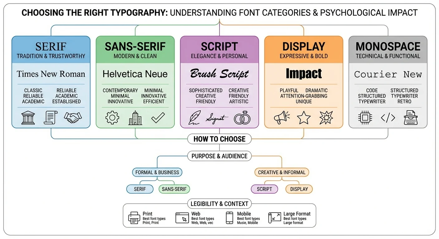
Serif fonts, characterized by small decorative strokes at the ends of characters, evoke feelings of tradition, reliability, and authority. They are the gold standard for established institutions. Conversely, Sans-Serif fonts offer a clean, modern, and efficient look, making them ideal for tech companies and startups focusing on Choosing the Right Typography for digital interfaces.
The Emotional Spectrum of Type
Psychology plays a vital role in how we process information. For instance, script fonts can feel elegant or creative, while display fonts are bold and eccentric. When Choosing the Right Typography, consider the following categories:
- Serif: Trustworthy, traditional, and serious.
- Sans-Serif: Approachable, objective, and contemporary.
- Slab Serif: Strong, bold, and confident.
- Monospace: Technical, nostalgic, and precise.
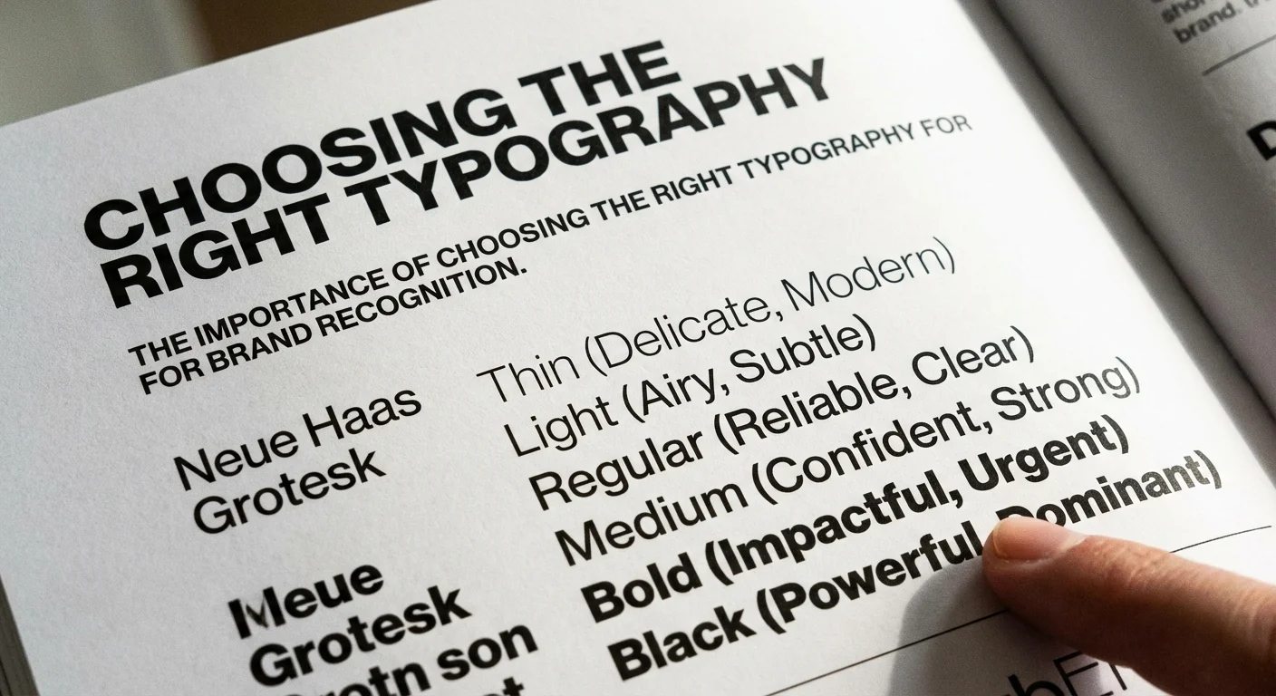
Effective design requires a balance between aesthetics and functionality. Choosing the Right Typography strategies for digital branding often involve pairing a high-personality header with a highly legible body font. If the contrast is too low, the design feels flat. if it is too high, it becomes distracting.
“Typography is the detail and the synthesis of the work. It is the clothes that your words wear.”
Ultimately, Choosing the Right Typography is about alignment. If your brand is playful, a rigid geometric font might create a disconnect. By mastering the psychological impact of different font categories, you ensure that your visual identity remains consistent and impactful across all platforms. Always prioritize readability while Choosing the Right Typography to maintain user engagement.
Practical Tips for Choosing the Right Typography for Your Website
Mastering the art of Choosing the Right Typography requires a balance between aesthetic appeal and functional clarity. When you begin the process of Choosing the Right Typography, your primary goal should always be readability. A font might look beautiful in a design tool, but if it fails to communicate your message clearly on a mobile screen, it serves no purpose. High-contrast pairings and generous line spacing are essential components of a professional digital presence.
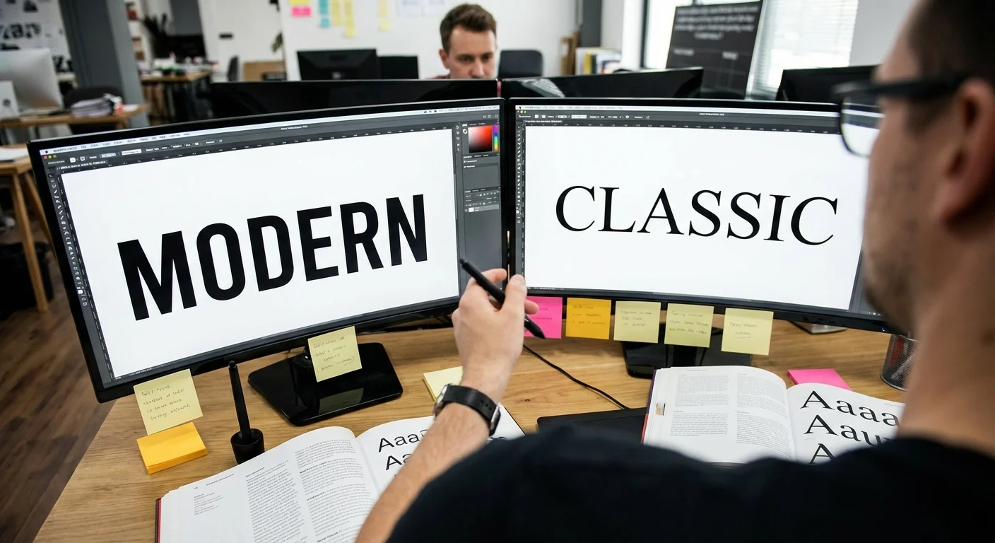
To streamline your workflow, consider these essential steps for Choosing the Right Typography:
- Limit your selection to two or three typefaces to maintain visual harmony.
- Prioritize web-safe fonts or reliable libraries like Google Fonts for faster loading speeds.
- Ensure there is enough contrast between the text color and the background.
- Test your scales. headings should be distinct from body copy to create a clear hierarchy.
Choosing the Right Typography for modern web accessibility ensures that every visitor, regardless of their device or visual ability, can consume your content. Many designers overlook the importance of x-height and letter spacing, yet these small details define the user experience. If you are looking to refine your creative process further, check out this UI/UX core checklist for more professional insights.
“Typography is the clothes that words wear. Choosing the Right Typography is about dressing your content for success in a crowded digital marketplace.”
Finally, remember that Choosing the Right Typography is an iterative process. You must preview your choices across different browsers and operating systems. What looks crisp on a Mac might appear jagged on an older Windows machine. By consistently testing and refining your type choices, you ensure that your brand remains authoritative and accessible. Choosing the Right Typography is not just a design task. it is a fundamental pillar of effective communication that directly impacts your site’s conversion rates and user engagement levels.
Ultimately, choosing the right typography is a fundamental pillar of a successful brand identity. Your fonts do more than just display text. they communicate your brand’s personality, values, and professionalism to your target audience. By balancing aesthetic appeal with practical legibility and psychological impact, you create a cohesive visual language that resonates across all digital and physical platforms. Consistency remains the key to building long-term recognition and trust with your customers.
Mastering the art of choosing the right typography ensures your message is heard clearly while distinguishing your business from the competition. Do not underestimate the power of a well-chosen typeface to elevate your entire brand presence. Are you ready to transform your visual strategy and make a lasting impression? Contact our expert design team today for a personalized consultation to find the perfect fonts that will truly define your unique brand story and drive engagement.
FAQ
Why is choosing the right typography essential for a brand’s visual identity?
Selecting the correct fonts ensures that your brand communicates its personality and values effectively to your target audience. Choosing the right typography creates a cohesive look that builds trust and improves brand recognition across all marketing channels.
How can businesses ensure they are choosing the right typography for readability?
To maintain high readability, you should prioritize font weight, letter spacing, and contrast against the background. Choosing the right typography involves testing your selected fonts across different screen sizes and print formats to ensure the message remains clear for every user.
What factors should be considered when pairing different fonts together?
When pairing fonts, it is important to create a balance between harmony and contrast, such as combining a bold serif heading with a clean sans-serif body. You should limit your selection to two or three distinct typefaces to avoid visual clutter and maintain a professional aesthetic.
Service & Contact
Locatie: Marbella, Spain
Werkgebied: Marbella, Málaga, Costa del Sol, Andalusia, Spain, Remote, Worldwide
Diensten: Brand Typography Strategy, Font Selection and Pairing, Custom Typography and Wordmark Design, Brand Guidelines and Typography Rules, Font Licensing and Usage Compliance, Typography System for Web and Print, UI Typography for Websites and Apps, Accessibility and Readability Review, Template Design with Typography Styles (social, brochure, pitch deck), Brand Audit and Typography Refresh
Openingstijden: Mon-Fri 09:00-18:00
